Product Development

Designing a Loyalty Reward Program App

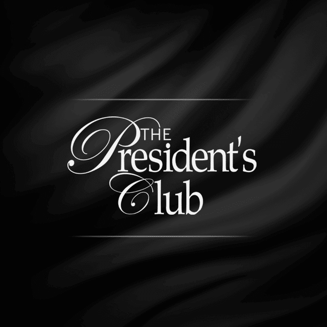
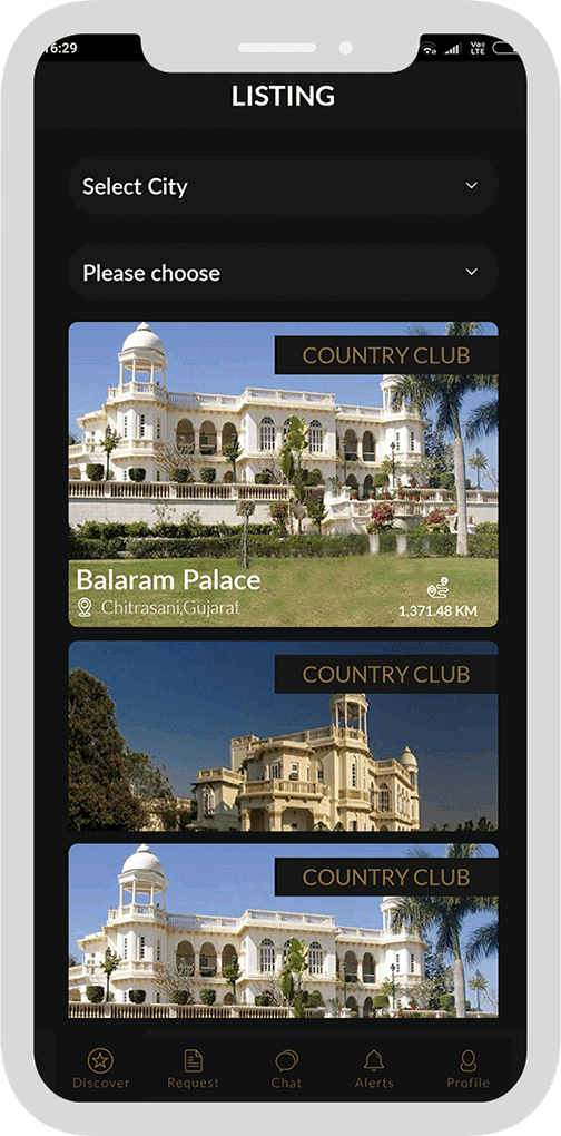
Recently we published a case study on a loyalty reward program app designed for our client, Samsung. The app was aimed at Samsung’s loyal partner base. In an effort to thank them, Samsung introduced the President’s Club.

Here are some takeaways from our designing session while we worked on creating this loyalty reward program app.

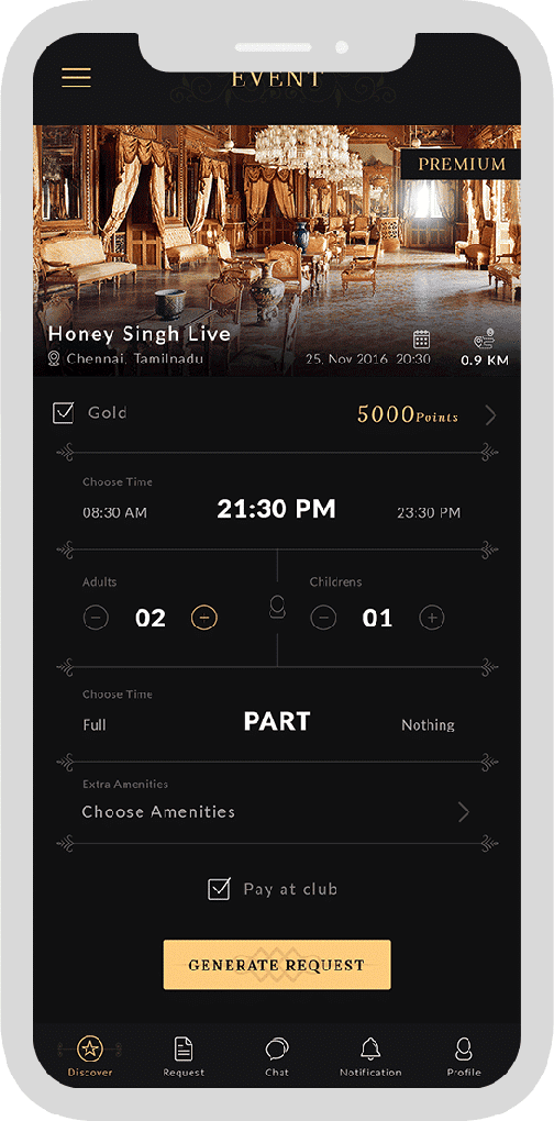
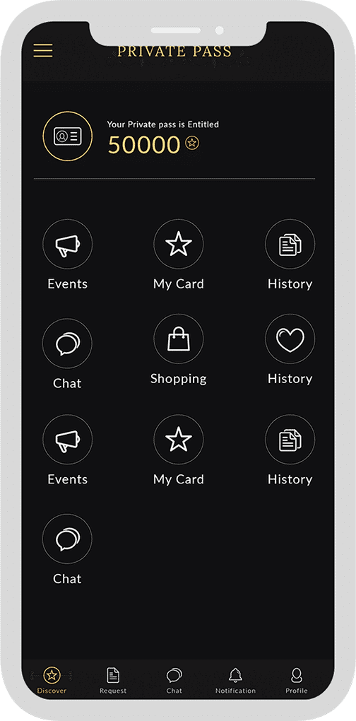
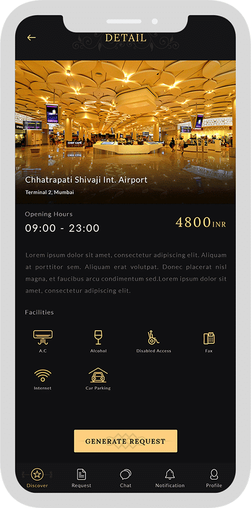
One of the best approaches to creating any app is to create one which fits the target audience by usage and design. In this case, as the name indicates, the app needed to be sophisticated yet simple, however with a pinch of extravagance.

Colors

The above-mentioned observation about the app’s name and the target audience, helped us zero down on the colors of black, white, and golden for our target audience.

As per the studies of how colors can have an impact on the audience’s psychology, here are what the colors represent:

Black: Suave and classy, black also represents formal and chic. With a black background, we created the possibility of presenting graphics and pictures in various colors without affecting the picture content. The black background sets for a perfect backdrop.

White: White goes as the perfect color contrast when it comes to a predominantly black ground. It brings in some ease to the eye when it comes in the form of white fonts on dark backgrounds. Also, it symbolizes easy, clean, and fresh.

Golden: Finally, the golden color stands for wealth, wisdom, valuable, and prosperity. By using this color, we delivered Samsung’s thoughts of holding their loyal partners in high value and wishing them success, wealth, and prosperity.

Needless to say the 3 colors together, create an air of an offering which is a class apart. Something that we strove to create ever since we started working on the President’s Club project.

Design

The users of the app would be people who are confident, modern, and usually very busy. They are being offered a premium loyalty reward program app. The app is going to aid them by helping them outsource some of their work. This could be through concierge services or by easily booking evenings out or even vacation via only a few clicks.

The functionality and usability of any app is of utmost importance to any developer. But UX designing, too has become one of the ruling factors when it comes to smooth and seamless app designing. It should not only be easy to use, but also must appear tasteful. We tried doing just that. Minimum text and maximum usage of graphics without making the app size-heavy. The idea is that the users understand which icon leads to where without much complexity.

Everything has been made easily accessible so users can get to the function they need no further than 2-levels down.

The base menu looks something like this:

  • Discover
  • Requests
  • Chat
  • Alerts
  • My Account

Simple and easy to understand with tabs which the user will use most frequently.

Wireframe

Here’s a look into what our first-level wireframe looked like. You can find out more about our works, and final products and wireframe, here.

Have a product or an app idea? We would be glad to assist you with its development and implementation. Contact us for a free consultation, today!

Schedule an appointment today and receive a complimentary consultation.

About Author

Avinash

Avinash is working with Roars since 6 Years and total experience is about 12+ Years in Project Management. His endless desire to learn new things developed his interest in product development. He likes to unwind by watching online series or reading when he is not working.