

5 Simple Guidelines for Mobile app design
In this age of hyper-digital, mobile apps are the main way people shop, learn, work, and have fun. There are millions of apps on the App Store and Google Play, and the difference between success and failure is often just one thing: mobile app design. A well-designed app not only looks good, but it also works well, is easy to use, and keeps users coming back.
When you download an app that is hard to use, slow, or full of junk, you are more likely to uninstall it right away. Apps that follow clear app design principles, on the other hand, are easy to use, fun, and seamless. This is why businesses that want to do well in today’s competitive market need to focus on smart, user-centered design.
In this blog post, we’ll look at five simple but very useful rules for designing mobile apps that can turn any idea into a great digital experience.
Why Mobile App Design Matters
An app that has been carefully planned is more than just a pretty face. It connects the user to technology, making sure that goals are met with as little trouble as possible. Bad mobile application design can lose businesses customers, money, and their good name.
This is why design is so important:
- First impressions are very important – Users will make a decision about your app in a matter of seconds. They’ll leave quickly if it doesn’t look polished.
- User engagement goes up – A well-designed mobile app makes users want to explore its features and spend more time in it.
- mobile application design – Apps that are easy to use often become daily companions.
This means that businesses must invest in good design if they want to build trust and stand out in a crowded market.
5 Simple Guidelines for Mobile App Design
1. Prioritize User-Centered Design
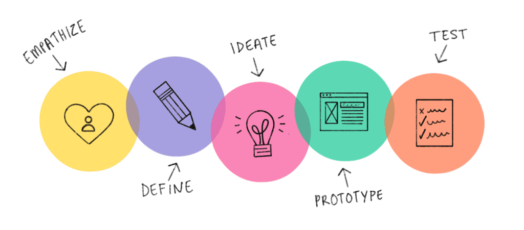
To make a great app, you need to know your users. It’s important to find out who your users are, what they want, and what problems they have before you even start to design a mobile app.
Putting the customer at the center of every decision is what user-centered design means. Make personas, map out user journeys, and test prototypes to make sure your product really meets their needs.
Important Tip:
You are more likely to make an app that people love if the mobile application design matches how real users act and what they want.
2. Keep Navigation Simple and Intuitive
One of the most important rules for designing apps is to keep them simple. When menus are hard to read, buttons are hard to find, or scrolling never ends, users get angry. Instead, focus on being clear and consistent.
- Check that everyone can see the icons.
- Limit the number of steps you need to take to finish important tasks.
Why It’s Important:
When mobile app design, it’s important to make navigation easy. This way, users can spend more time exploring features and less time trying to figure out how things work.
3. Pay Attention to How Things Look and How Easy They are to Read
People can understand visuals faster than words. A solid visual hierarchy makes sure that the most vital sections stand out and the less crucial ones stay in the background.
Good mobile application design uses colors, typefaces, and spacing to get people’s attention. For instance, your main call-to-action button should be different from the rest of the page so that it stands out, and content should be easy to see even on small displays.
Keep in mind that readability is very important when you design a mobile app. Fonts that are too fancy or colors that don’t stand out can make your app hard to use for people with visual impairments or make it boring to use.
4. Make Sure it Works Quickly and Well
People want apps to work right away. Even the nicest design won’t work if the app is slow. So, making sure that an app works well is a really vital part of mobile app design.
- Make sure your images and animations are the right size so that they load quickly.
- Cut down on background processes that make devices run slower.
- To avoid performance problems, test often on different devices.
A fast, responsive, and light app gets better reviews and makes users happier.
5. Ensure Accessibility and Inclusivity
Accessibility means that anyone, no matter their physical or mental ability, can use your app. Not only is it right to mobile app design that is accessible to everyone, but it also lets more people use them.
- Offer color choices that stand out.
- Let people choose between voice controls and text-to-speech.
- Allow users to modify the font size to make it simpler to read.
When you build app design principles in mind, you show consumers that your business cares about fairness and inclusiveness. This may make your reputation much better.
Best Practices That Go Beyond the Basics
There are more than five main techniques to make your app better:
- Responsive layouts: Your site should work on a wide range of devices and screen sizes.
- Feedback all the time: Get feedback from users and make changes often.
- Find a balance between function and creativity. Too many details in a design may appear good, but they also make things hard for consumers.
These methods assist make sure that your mobile app design stays up to date with what your consumers need as their needs evolve.
Common Mistakes to Avoid in Mobile App Design
Good design leads to success, but mistakes can quickly ruin the experience for users. A few common mistakes are:
- Putting too much content or too many features on screens.
- Not paying attention to beta user feedback while testing.
- Small fonts or low color contrast make it hard to read.
Your mobile application design stays polished, functional, and easy to use if you avoid these mistakes.
Conclusion
When mobile app design, it’s important to do more than just make it look good. You also need to make sure that it works well and is fun to use. To make apps that really stand out, you should put users first, make navigation easy, improve performance, make sure they are accessible, and make sure they are easy to read.
These five simple rules are the building blocks of success. They help both established businesses and new businesses follow good app design principles. You can use these tips to make a mobile app from scratch or improve one that already exists. They will make the app easier to use, keep users coming back, and build trust with users.
Schedule an appointment today and receive a complimentary consultation.